Two charts caught my eye this week.
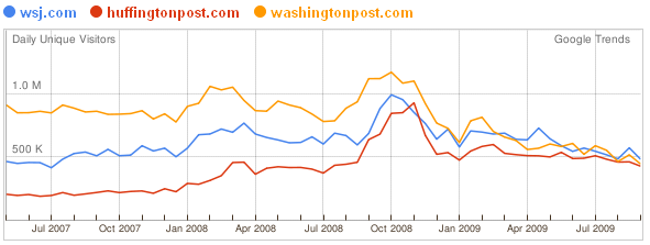
I swiped this one from Andrew Sullivan. The Washington Post's website is dipping, while HuffPost is slowly increasing in popularity. Wowsies.
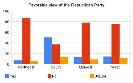
Even though JT scorns the colors, this chart is also awesome. It was swiped from Steve Benen. Why is the South so different from the rest of the nation? Is it part of the legacy of slavery? Number of Baptists? Guns?


