
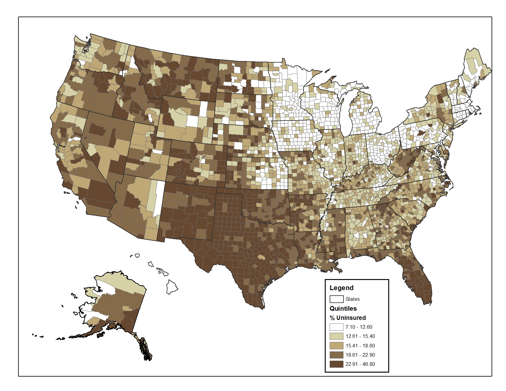
 The Monkey Cage has a fascinating map of the where the uninsured are in the country.
What explains these stark geographic differences? I say unions and illegal Immigration. States with strong unions and low illegal immigration are clearly the winners on this map.


Another factor that I saw in looking at dark spots in lighter clusters? You’re seeing university towns where, presumably, far too many students go without health insurance.
See Tippecanoe and Monroe counties in Indiana — the homes of Purdue University and Indiana University? Can’t miss those two dark spots.
*sigh*
LikeLike